




Casino Versus Playground: The Story of Competing Taproom Philosophies
 Story by:
Beer Blog
Story by:
Beer Blog
There is a surprisingly interesting commonality in the way brewery taprooms have been built in the past few decades. If you want to keep the original meaning but make it smoother and more engaging: Close your eyes, and you can picture it for yourself: the exposed high ceilings, clear views of the brewing tanks, and perhaps roll-up garage doors stretching along one wall.
You’re probably picturing communal tables rather than booths, and an open, social space. The funny thing is that the way we got there matches the battle casino designers went through in the second half of the twentieth century.
Friedman’s Colorful Labyrinths
For a long while, the dominant theory belonged to Bill Friedman, a casino executive who ran the Castaways and the Silver Slipper in the 1960s before teaching casino management at UNLV. His book on casino design laid out thirteen principles drawn from studying which Las Vegas floors were busiest.
His theses were uncompromising. Ceilings should be low. Sightlines should be short. Passageways should wind rather than run straight. It got pretty granular at some points – he explained that gaming equipment belonged immediately inside the entrance, because a large open lobby wasted the space. Decor was a distraction, and, with the lack of clocks and the bright, unnatural lights, you could be forgiven for thinking you found yourself in a labyrinth. For roughly thirty years, this was the dominant way of laying out a casino in Nevada.
Thomas’s Theory: Comfort, Not Confinement
You might have already clocked that some of the biggest casinos in Vegas – Mirage, Treasure Island, and the Bellagio – inverted basically all of these principles. That is courtesy of designer Roger Thomas, working alongside Steve Wynn, whose reasoning was that people behave differently in rooms where they feel at ease compared to rooms where they feel hemmed in, leading to what is now known as “playground design.”
The ceilings were made taller and decorated or covered with luxurious silk fabric. Sightlines opened. The Bellagio lobby got a Chihuly glass sculpture instead of a bank of machines. Windows and skylights made a grand return – and, shock, horror, so did clocks. Thanks to this work, Thomas was inducted into the Interior Design Magazine’s Hall of Fame in 2015.
Casino design continues to evolve, and an interesting wrinkle arises when you remove the room. Online operators have none of these physical tools, but also aren’t limited by the confines of space. Their approaches are typically Thomas-like, which is why platforms offering bingo slots online with clear on-screen layouts end up solving navigation in a playground-like manner rather than with a labyrinthine user experience. Of course, for those involved with UX and digital design, the whole idea that you need to make a space readable or people won’t settle into it is entirely straightforward.
The Taproom Treatment
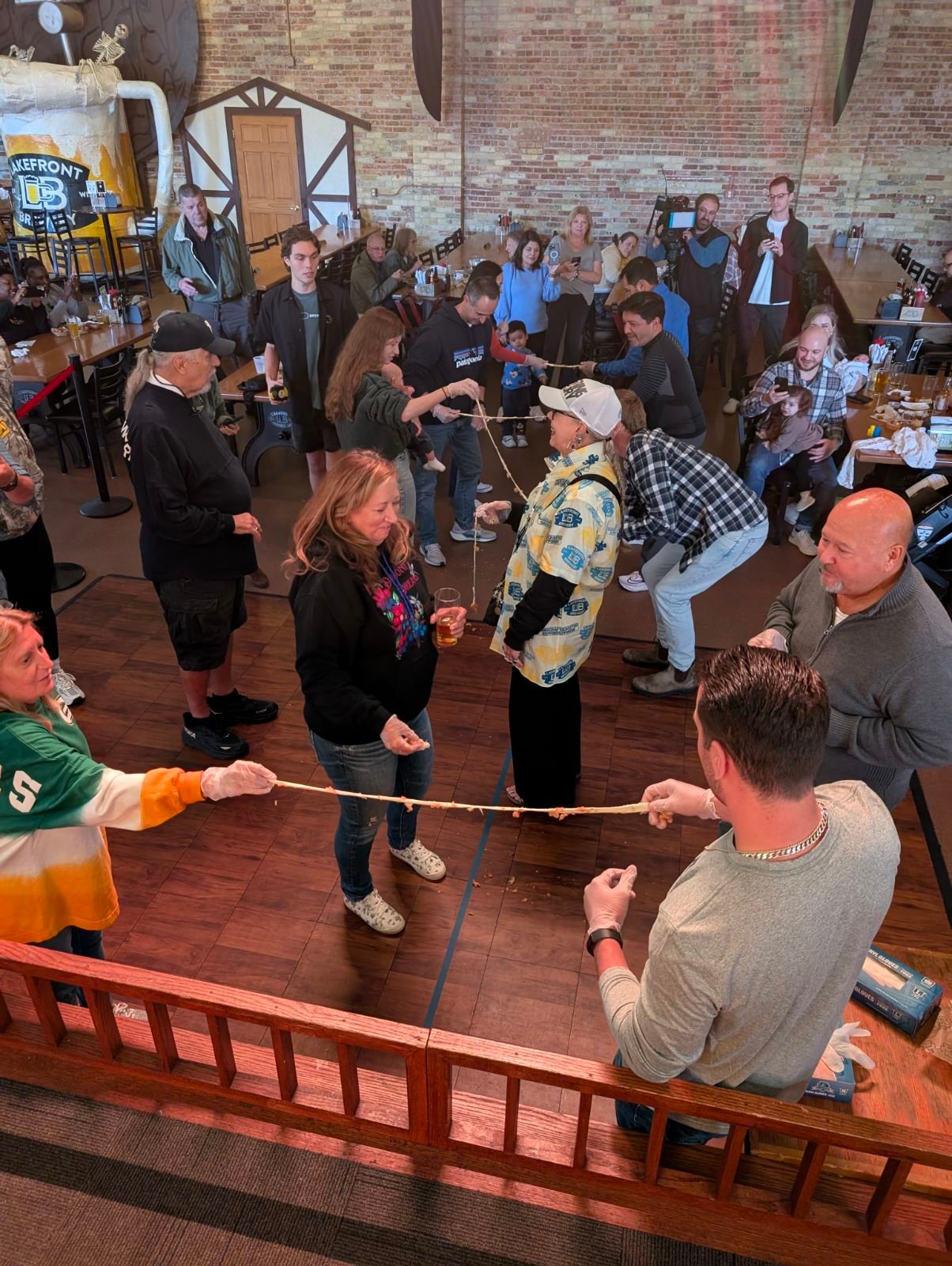
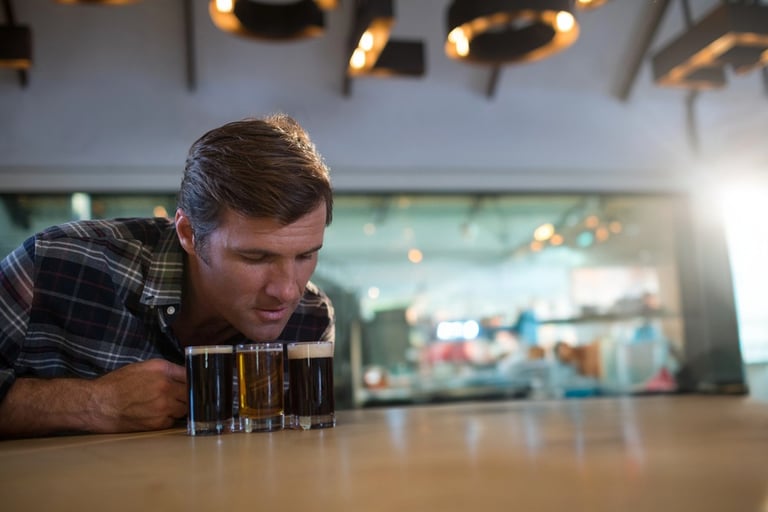
These days, taprooms also opt for height, light, and legibility over enclosure and the dingy pub vibes. Comfort and ease, rather than a trap. PorchDrinking’s Las Vegas brewing coverage makes the parallel clear, given how many of those breweries operate just a few miles from the floors where the argument was originally settled. The Oakwell Beer Spa franchise heading to Vegas is arguably the two traditions collapsing into one building.
As Punch has documented, taprooms spent years as essentially transactional spaces until around 2013, when the hospitality aspect began crowding out retail. Trade coverage of taproom design now reads like a Thomas manifesto with better lighting budgets: communal tables and drink rails to encourage conversation, layered seating, and food on site. We’re still waiting for digital taprooms, though – that will have to remain a future innovation. For now, the real experience still comes from stepping into a taproom, discovering new pours, and enjoying a beer in a setting designed around the craft.


Comments 0
No Readers' Pick yet.